


One of the best and worst things about statistics is all the different ways that there are to represent data. There are histograms, box plots, pie graphs and more. I mean, how are you supposed to choose which way to represent the data? One of the quickest ways to represent data is a stem and leaf plot. A stem and leaf plot is a quick way to look at the distribution of data using the values themselves instead of frequency or range. They are separated by tens and ones. That is the stem the tenths and the leaves are the ones.
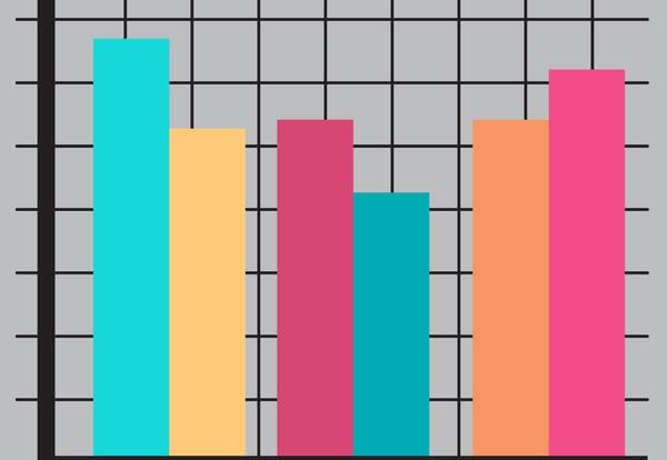
Histograms come in two types: frequency and relative frequency. They are a type of bar graph in which the bars touch and the vertical axis shows how often something occurs. Stem-and-leaf plots are similar to histograms in that they can show trends in the data set; however, they have an advantage: they show individual data values. Pie graphs are different from the other two discussed here for two reasons: they can illustrate qualitative data along with quantitative data and they allow comparisons to be made (“parts” to the “whole”)

